A head for the polls
Wherein I forecast election outcomes using a minimum of data.
Election forecasting is big business. Consider the revenue that pays for the staff that works at FiveThirtyEight. Consider how much time news companies spend talking about horserace polling. Consider the whole info-tainment complex that made Steve Kornacki a heartthrob. In 2020, direct spending in all House races exceeded $1.1b, which comes to the average race for a Congressional House seat costing \$2.5m between the two major party candidates. This leaves money for a full-time campaign staff, polling firms, etc. There’s tons of data, and with about 750,000 people in a House district (on average, with a lot of variation actually), there’s a lot of data to chew on, parse, and identify.
A fairly normal number for a state legislative Senate race in Colorado for a candidate is, like, \$100,000, and they probably have a campaign manager who works part-time.
The Colorado State Senate has 35 seats with four year terms, the terms staggered so half of the body is up for re-election every two years. Their salary is about \$40,000/yr, in a state with a median home price over \$500k, so this isn’t a job you do for the money.
The typical district has about 165,000 people living in it (compare to 720,000 in a Congressional House district), and the elections are much lower profile despite having more direct effect on your day-to-day life in most situations than the national elections. In fact, the profile is so small and the campaign funds are so limited that very small sums of money can swing an entire state legislature, something that various organizations like to point out.
I’m going to talk about the Colorado State Senate 2020 elections because I worked closely with a statewide group on this, and also the data visualization is a little easier on a webpage, what with there being 18 races instead of 65 in the House. The org was trying to figure out where to allocate the limited money they had for the various Senate races, and this involved trying to predict which races were going to be close and winnable, and which races were safe enough that you could put in a bare minimum of resources to hold the seat or not bother trying to beat the opponent.
Working with Small Data
What’s the data?
The Colorado Secretary of State’s office makes a fair amount of information available about vote outcomes, registration, etc. In particular, it currently provides voter registration statistics and election outcomes at the precinct level. At the time that I started on this project, precinct-level data was inconsistent from year to year, but the datasets also provided District (Senate or House districts) as well as County.
To get the most granular data possible, I cleaned this up to look at District-County pairs of data. At District level, there’s just not a lot of data points to work with, and so splitting by the counties within the districts added a fair number of data points for registration and outcome. County data can split between districts — for example there are about five State House Districts covering various parts of Boulder County, whereas some of the districts in the Eastern Plains will cover multiple counties. There are 35 total Senate districts, and 64 counties in Colorado, so we can expect this to sorta double the number of data points to work with.
So District-County pairs makes the most sense as a unit to subdivide the datasets given the information available (at the time that I started this project, again because having precinct-level data consistently is a 2021 thing and this project was a 2020 thing).
Is there a there there?
The first question is, well, is there any actual information in the voter registration data? After all, West Virginia is about evenly split between Democratic, Republican, and No Party and yet it’s an extremely safe Republican state. Colorado has a similar partisan breakdown, so the first question is if there are any actual trends to be had from the political affiliations.
It turns out, yes, there are some pretty clear trends. Below is a plot of vote share versus partisan affiliation in each County-District for the 2018 midterm state Senate elections.
Yep, that’s a trend
The vertical axis is the fraction of the vote gotten in a particular District-County, and the horizontal axis is the fraction of that D-C’s partisan affiliation for Democrats, Republicans, or Other. The size of the dot indicates the total number of registered voters in that D-C.
What we can see is that there’s a clear linear trend between major party affiliation and their share of the vote in each D-C. The wildcard is the unaffiliated “O” voters — the correlation just doesn’t exist, but they are clearly quite an important voting bloc. Statewide, they must trend Democratic, since the slope of the D vote versus D affiliated (upper left) is a little greater than the slope of R vote versus R affiliated (center square).
This looks at one set of correlations at one point in time — given the partisan affiliation makeup of a D-C, what was the vote outcome? When I fit a sigmoid function to this (because the vote fraction has to go between 0 and 1), there’s a fair bit of uncertainty in the fit even if the line is pretty clearly straight. But we haven’t exhausted all of the data, since we still have historical voting and affiliation data for each County-District.
A Deeper Sort of Model
There’s a pretty strong linear correlation between what fraction of a D-C is registered with a political party and the vote share they got in the election, but there’s a lot of variance because of unaffiliateds, and there’s also more data than the registration make-up at the time of an election and the outcome of that election. These are voting districts, and I restricted myself to the time after the last redistricting, so we’re not just randomly sampling, there’s a history of data here.
The obvious next step was then to build a model that uses the registration and the outcome of the last election, combined with the registration leading into the current election, to predict the outcome of the current election. That voting history contains some information for how the O voters break in a given district — for instance, districts in Denver city proper are extremely Democratic, but most of the voters are unaffiliated. We know they have to break heavily Democratic from the historical data, so we can build a model that takes that historical input and learns what the output should be. And we know this information is correlated pretty consistently across the state, so we aren’t barking up the wrong tree.
To wit, I built a shallow neural network that has 9 nodes at the input layer, shrinks to 2 nodes in a single hidden layer, then outputs the vote share for D, R, and O. I did nothing to tell the neural network in training that these should sum to 1, but I did it check and the neural network was very good at figuring that part out using just RMS error as the loss function.
Why shrink to two nodes in the hidden layer? Because voters only had three options, and if you didn’t pick two, you had to pick the third, so it is in fact a two-dimensional output even if it looks three-dimensional. Why did I add an output layer with three outputs? Because it was unclear how to translate that latent space into the three votes directly and I wanted the model to have a little more flexibility in its ability to train.
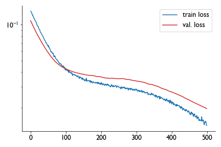
So I trained a neural network model with 9 inputs, a tanh layer, a gaussian noise layer (for regularization), and a sigmoid output layer with three values, and got this training curve:
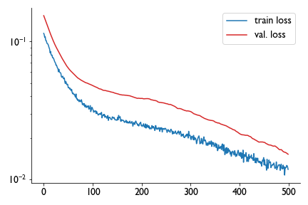
Satisfied with a day’s work, I closed the notebook without saving the model. There’s 29 trainable parameters and less than a hundred points in the whole dataset, it just wasn’t that onerous to train again on the fly. So the next day I picked up, trained again, and got a different training curve:
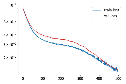
If the first one was training okay, this one seemed to be consistently overfitting. So I ran it again and got a third training curve that suggested the model was spot on.
Hm. So I compared the predictions for multiple different models, trained using different train-test splits, and found quite different predictions for the test set despite having broadly similar loss functions. Training for longer did not really help this problem, and changing the architecture, adding layers, etc. didn’t help either.
Hm.
Election forecasting as statistical guessing
One of the assumptions going into training a machine learning model a lot of the time is that your train-test set sample randomly from a uniform, static distribution. This is not how elections work. In this case we are feeding the model data from the same districts at different times, and the behaviors of those districts can drift a little as people move in or out, the politics changes, etc., but they are generally pretty static.
Think of it like slot machines. Normally when we do a train-test split, we are assuming that each pull is the result of a pull from one slot machine, and we do many pulls of the slot machine. In contrast, each D-C is its own slot machine, and we have one pull from that, and from that plus any other data we have we try to infer what the distribution might be.
So the data for a single election isn’t really multiple random samplings from a single distribution, it’s is actually a single random sampling from many changed, unknown distributions that are sorta static.
There are so many outside variables that are difficult to account for even in national elections where the budgets are seven figures and polling companies try to gauge partisan enthusiasm etc., that my little model using simple historical data was never going to actually provide a quantitatively predictive outcome with great certainty in the same way that you can guess the mean value of a normal distribution but if you only sample from it once you have no idea whether it returned the mean or something three sigma off the mean.
So on the one hand, quantitative prediction of the outcomes was going to be precarious, error-prone, and as it turned out pretty sensitive to the train-test split. But when it comes to making decisions like allocating resources, you don’t need to know the outcome with extreme precision, you need to know qualitative stuff like whether the race is in any way competitive. What you want is some estimate of the distribution of outcomes, to answer the practical question: Is this race close?
This reframed the problem from a deterministic prediction one to a statistical estimate one. If I trained many of these models and fed it 2020’s inputs (2016 election results + registration data and 2020 registration data, CO Senate elections are every four years), I could get a range of values for the outcome and look at the distribution. The more the overlap between the two major parties, the more competitive the race might be.
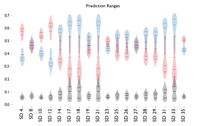
So that’s what I did. I trained a hundred models for the Senate elections using the same architecture but different train/test sets, and I found this:
There is a violin plot for D (blue), R (red), and O (gray) prediction distributions as vote share in each district. The three horizontal lines mark the median and 25/75 quartile of the data. The more the distributions overlap, the more competitive the district is predicted to be.
So, for example, in SD4 there was not a single model that predicted a D win, so if you’re allocating resources for either the Democratic or Republican party, it’s probably not worth putting too much money here. That election saw the Republican get 62% of the vote, and the Democrat receive 35%. In SD8, on the other hand, we got a donnybrook, and indeed in that district the result was R-.506, D-.494.
From these predictions, we could guess that SD8 and SD27 were dead heats; SD19, SD25, SD26, SD28, and SD29 leaned Democratic; SD23 leaned Republican; and the rest weren’t particularly competitive races.
And here are the actual results:
In the case of SD29, the Republicans did not field a candidate and the usual Republican candidate ran as a Libertarian, so while that’s filed under O, it was basically an R campaign locally. The predictions were generally on point, “lean” elections were in the sort of 10-point range, the model was a little bullish for the D candidate in SD25 and that turned into a close race, and SD26 ended up in the sort of 90th-percentile range of predicted outcomes, but overall the model did a decent job of figuring out what races should be competitive and what races were likely blowouts.
One problem that shows up in the model is the range of predictions for third party candidates. Because there just aren’t that many data points — excluding SD29 there were only 6 out of 17 races with a third party candidate — the presence or absence of a candidate running under a particular party needs to be explicitly handled in the model going forward.
Always Looking to the Next Election
This model actually worked quite well, and I’d be comfortable deploying it for elections right up until redistricting blows up my historical data, and we have to look long and hard at whether that linear relationship we discovered is persistent across years or not. But there are a few things I’d like to do a little differently.
Third wheels
There isn’t always a third party candidate on the ballot in these districts. Usually in Colorado if there even is one, it’s a Libertarian or Green candidate for these state legislative elections. The lack of a third party candidate in an election is not something I included in the model — I just fed the output of zero if it was only the two major parties voting.
This is a problem since that fact varies year to year, so the model has no way of knowing right now if there is a third+ option for voters. Adding a tenth input variable that’s 1 for a third party candidate and 0 for not, so the model can learn the difference between “there isn’t a third option” and “there is a third option, but nobody voted for them” might improve the errors a little bit, since most of the errors in forecasting are well within the gray range.
Correlations between districts
In this model, each data point was a single Senate D-C pair with a little history, which does not account for something very important that a lot of election models missed in 2016: voting outcomes are correlated. To capture these correlations explicitly, we would need to give the model all the registration+historical data as inputs and combine all the results as outputs. The problem with this is that we already have a very small dataset, and this would just make it smaller i.e. each election is one datapoint instead of each D-C. However, since there are correlations between the individual D-C data points, one might also assume that such correlations will be picked up with the models. This is something I did not explore, and probably should.
Statistical forecasting of the chamber make-up
Ultimately what you care about isn’t each individual election, but the aggregate outcome of all elections that sets the make-up of the legislative body and, therefore, whose agenda is front and center. So a next level of analysis would be to take the distribution of predicted outcomes and convert it into a distribution of net swings in the chamber as a result of these elections. That way we’ll be forecasting not just who wins individually, but how the individual competitiveness of these races reflects in the composure of the chamber at the end of the whole election. That takes these micro-scale predictions and turns them into macro-forecasting.


